Half-plane initial conditions.
When  is close to
  the region of
polluting car buyers shrinks in time (see fig.2).
The fraction of agents choosing polluting cars
decreases to 0 as does pollution.
In this figure,
the region of
polluting car buyers shrinks in time (see fig.2).
The fraction of agents choosing polluting cars
decreases to 0 as does pollution.
In this figure,  =9.5, which represents
a small difference with
=9.5, which represents
a small difference with  as compared to the maximum
pollution cost of 40. The total domination of the market
is achieved in less than 100 steps.
as compared to the maximum
pollution cost of 40. The total domination of the market
is achieved in less than 100 steps.
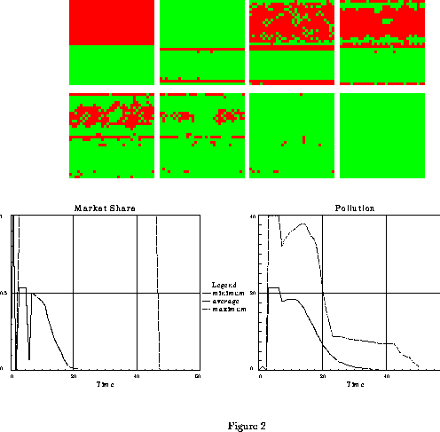
Figure 2: Fast evolution towards market
domination by non-polluting cars
in case of a small difference in prior utilities ( =9.5),
and intermediate term memory (
=9.5),
and intermediate term memory ( =32), s=10,
all the other parameters
being defined in the text. The eight patterns represent the
spatial distribution of car choices at times t=0 , t=1 , t=2
and 5 from left to right
for the upper patterns and at times t=8 , t=11 , t=15 and 50
from left to right
for the lower patterns.
The time 0 pattern corresponds to the initial conditions for simulation.
The 32x32 grid of agents is half filled with buyers of polluting cars,
the black squares, and half filled with buyers of non-polluting cars,
the light grey squares. Circular boundary conditions are used.
The two lower figures represent the time evolution
of the market share of polluting cars and of pollution.
The three lines in the pollution graph correspond to minimum, average, and
maximum pollution on the grid.
At time t=1, an inversion of car choices occurs in the polluted region
(see the Don Juan effect defined in the text).
Invasion by non-polluters then occurs
in a straightforward manner from the non-polluted region.(Done using
SWARM software).
=32), s=10,
all the other parameters
being defined in the text. The eight patterns represent the
spatial distribution of car choices at times t=0 , t=1 , t=2
and 5 from left to right
for the upper patterns and at times t=8 , t=11 , t=15 and 50
from left to right
for the lower patterns.
The time 0 pattern corresponds to the initial conditions for simulation.
The 32x32 grid of agents is half filled with buyers of polluting cars,
the black squares, and half filled with buyers of non-polluting cars,
the light grey squares. Circular boundary conditions are used.
The two lower figures represent the time evolution
of the market share of polluting cars and of pollution.
The three lines in the pollution graph correspond to minimum, average, and
maximum pollution on the grid.
At time t=1, an inversion of car choices occurs in the polluted region
(see the Don Juan effect defined in the text).
Invasion by non-polluters then occurs
in a straightforward manner from the non-polluted region.(Done using
SWARM software).
The dynamics of invasion of the grid by non-polluters differs according to the difference in prior utilities. For small differences (see figure 2), the invasion proceeds directly from the non-polluted region. For larger differences, spots of non polluting purchasers appear in the polluted regions, while the initially non polluted region is invaded by checkerboard patterns (see figure 3).
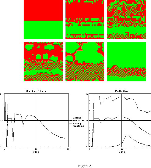
Figure 3: Evolution towards market
domination by non-polluting cars
in case of an intermediate difference in prior utilities ( =8.5),
and short term memory (
=8.5),
and short term memory ( =8), s=10,
all the other parameters
being defined in the text. The six upper patterns represent the
spatial distribution of car choices at times t=0 , t=6 , t=10
from left to right
for the upper patterns and at times t=13 , t=15 , t=36
from left to right
for the lower patterns.
Note the apparition and growth of islets of non-polluters from
the polluted region at times 13 and 15.
The two lower figures represent the time evolution
of the market share of polluting cars and of pollution.
The three lines in the pollution graph correspond to minimum, average, and
maximum pollution on the grid.
The early oscillations on these lines correspond to
an inversion of choices in the polluted region obtained
during the strong initial variation of pollution (refer to the Don
Juan effect in the text) The systems evolves towards complete domination
of the market by non-polluters at t=100,
as in the last pattern of figure 2 (not represented in this figure).(Done using
SWARM software).
=8), s=10,
all the other parameters
being defined in the text. The six upper patterns represent the
spatial distribution of car choices at times t=0 , t=6 , t=10
from left to right
for the upper patterns and at times t=13 , t=15 , t=36
from left to right
for the lower patterns.
Note the apparition and growth of islets of non-polluters from
the polluted region at times 13 and 15.
The two lower figures represent the time evolution
of the market share of polluting cars and of pollution.
The three lines in the pollution graph correspond to minimum, average, and
maximum pollution on the grid.
The early oscillations on these lines correspond to
an inversion of choices in the polluted region obtained
during the strong initial variation of pollution (refer to the Don
Juan effect in the text) The systems evolves towards complete domination
of the market by non-polluters at t=100,
as in the last pattern of figure 2 (not represented in this figure).(Done using
SWARM software).
In the beginning of the simulation, when pollution builds up rapidly, a few period 2 oscillations of the market share in the region of polluting car buyers are observed (figures 2 and 3). This is because the agents only update the utility of the car bought in their neighborhood, while keeping the former utilities for the other brand. Since pollution is increasing, the former utilities always appear higher, which make the agents switch their choice at each time step. We called this effect the Don Juan effect in reference to the classical myth; Don Juan has high prior expectations about Woman, which makes him constantly change his female partners because none can meet his expectations.
When the differences in prior utilities are increased, the convergence time increases until the transition is observed: the region of non-polluting cars buyers is invaded by polluting cars, and partial domination of polluting cars is achieved.
One striking observation is that
total domination of the polluting brand is not achieved
unless the difference in prior utilities get close
to the total cost of pollution
(corresponding to 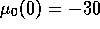 , for s=10).
Rather, one observe a transition towards a
mixed configuration of polluters and non polluters (see figure 4).
Changing the memory range (by changing
, for s=10).
Rather, one observe a transition towards a
mixed configuration of polluters and non polluters (see figure 4).
Changing the memory range (by changing  )
has some influence on the final pattern. With long term
memory, some memory of initial conditions is kept,
and the upper half plane is nearly filled with polluters,
even after 1100 time steps although the memory range is of the
order of 50. With short term memory, a uniformly random
final pattern is reached, closely resembling the one reached
from random initial distribution of purchasers (see figure 7).
)
has some influence on the final pattern. With long term
memory, some memory of initial conditions is kept,
and the upper half plane is nearly filled with polluters,
even after 1100 time steps although the memory range is of the
order of 50. With short term memory, a uniformly random
final pattern is reached, closely resembling the one reached
from random initial distribution of purchasers (see figure 7).
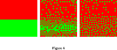
Figure 4: Slow evolution towards a coexistence distribution
among polluting and non-polluting cars
in the case of a large difference in prior utilities ( =7.5),
and long term memory (
=7.5),
and long term memory ( =256), s=10, all the other parameters
being defined in the text. The three patterns represent the
spatial distribution of car choices at times t=0 , t=32
and t=1100, from left to right. Note the regular metastable patterns corresponding
to
=256), s=10, all the other parameters
being defined in the text. The three patterns represent the
spatial distribution of car choices at times t=0 , t=32
and t=1100, from left to right. Note the regular metastable patterns corresponding
to  pollution at the lower half of pattern at time
1100, and the persistence of some memory of the initial conditions
at the upper half of the pattern. (Done using
SWARM software).
pollution at the lower half of pattern at time
1100, and the persistence of some memory of the initial conditions
at the upper half of the pattern. (Done using
SWARM software).
The existence of stable mixed configurations was a surprise to us, since we expected the risk aversion parameter to give rise to homogeneous attractors with eventual local defects due to noise terms. A close examination of local conditions show that polluters enjoy both a higher prior utility and a decrease in pollution due to the neighborhood of non-polluters. Non-polluters surrounded by polluters are screened from any up-to-date information about the non-polluting cars. The posterior utility they compute for the non-polluting cars does not include pollution, or when it does, it is at a lower level (old information). They thus stick to their previous choices.
The transition to market domination by the polluters
is discontinuous, the final market share
of polluting cars varying from 0 to more than 0.5 (0.75
is both a simulation estimation and theoretical conjecture
related to observed regular patterns, see below).
But due to the probabilistic character of information transmission and
the finite size of the grid, there are some uncertainties
on which attractor is reached in the neighborhood of
the transition. We have done some statistics, by doing
several simulations with the same set of parameters with
different random seeds. We then found that the
width in  of the transition is of the order of 0.18 for
a probability of a zero market share of polluting cars
varying between 1/3 and 2/3.
In the coexistence region, the final market share varies continuously
from 0.75 when
of the transition is of the order of 0.18 for
a probability of a zero market share of polluting cars
varying between 1/3 and 2/3.
In the coexistence region, the final market share varies continuously
from 0.75 when  is decreased, until total domination
of polluters is achieved at negative values of
is decreased, until total domination
of polluters is achieved at negative values of  .
.
Regular patterns appear, on both sides of the transition:
- The checkerboard pattern is built of alternating black
and white squares corresponding respectively to
buyers of polluting and non polluting cars.
The corresponding pollution is  since
the relative density of polluting cars is 1/2. (See figure 5 left).
This pattern is only metastable and it is eventually destroyed
by the noise terms. It can be observed on
figures 3, 4 and 6.
since
the relative density of polluting cars is 1/2. (See figure 5 left).
This pattern is only metastable and it is eventually destroyed
by the noise terms. It can be observed on
figures 3, 4 and 6.
-- The other pattern is made of
alternating lines of black squares separating lines of
alternating black and white squares, with pollution in this
region being  . (See figure 5 right).
This pattern is apparently stable in the coexistence region
for very long times (see figures 4 and 7).
. (See figure 5 right).
This pattern is apparently stable in the coexistence region
for very long times (see figures 4 and 7).
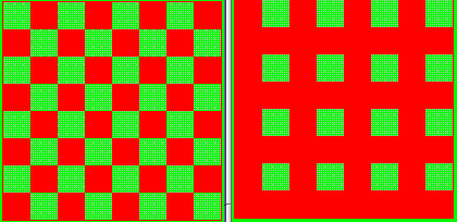
Figure 5: Regular metastable and stable patterns corresponding
to  pollution (left pattern) and
to
pollution (left pattern) and
to  pollution (right pattern).
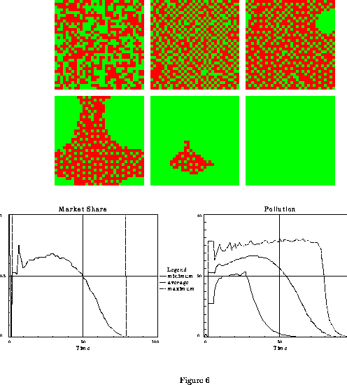
Figure 6: Evolution towards market domination by non-polluting cars.
The initial conditions are a random distribution
of polluters and non-polluters.
The conditions are a small difference in prior utilities ( =8.8),
short term memory (
=8.8),
short term memory ( =8), s=10,
all the other parameters
being defined in the text. The six upper patterns represent the
spatial distribution of car choices at times t=0 , t=30 , t=36
from left to right
for the upper patterns and at times t=41 , t=51 , t=71
from left to right
for the lower patterns. Note the apparition and growth of an
islet of non-polluters at times 36, 41 and 51.(Done using
SWARM software).
=8), s=10,
all the other parameters
being defined in the text. The six upper patterns represent the
spatial distribution of car choices at times t=0 , t=30 , t=36
from left to right
for the upper patterns and at times t=41 , t=51 , t=71
from left to right
for the lower patterns. Note the apparition and growth of an
islet of non-polluters at times 36, 41 and 51.(Done using
SWARM software).
These translational symmetric patterns are local attractors of the dynamics. They are a compromise between the lower cost of polluting cars and the lower pollution due to the presence of non-polluting cars. They represent metastable and stable configurations of non-polluters and cheaters that benefit from the presence of the non-polluters. This coexistence of cooperators and cheaters is similarly observed in many simulations of the iterated prisoner dilemma, as observed by Lindgren [8] and Nowak and Sigmund [9].
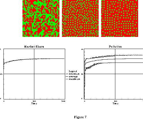
Figure 7: Slow evolution towards a coexistence distribution
among polluting and non-polluting cars.
The initial conditions are a random distribution
of polluters and non-polluters.
The conditions are a large difference in prior utilities ( =8),
longer term memory (
=8),
longer term memory ( =64), s=10,
all the other parameters
being defined in the text.
The three patterns represent the
spatial distribution of car choices at times t=0 , t=39
and t=980, from left to right. Note the regular metastable patterns corresponding to
=64), s=10,
all the other parameters
being defined in the text.
The three patterns represent the
spatial distribution of car choices at times t=0 , t=39
and t=980, from left to right. Note the regular metastable patterns corresponding to  pollution.
The two lower figures represent the time evolution
of the market share of polluting cars and of pollution.(Done using
SWARM software).
pollution.
The two lower figures represent the time evolution
of the market share of polluting cars and of pollution.(Done using
SWARM software).
The characteristic length in these patterns is determined by the characteristic length of information propagation. The wavelength 2 patterns of figures 4 are observed when 5 neighbors are polled, but 2x2 square patterns are observed when 12 neighbors are polled.
Initial random distribution of polluters and non-polluters generate final spatio temporal patterns, (see figures 6 and 7), similar to those generated by homogeneous half plans initial configurations.